Why Simpler Websites Almost Always Convert Better
Many businesses assume that adding more features, pages, and options will make their website stronger.
But the opposite is usually true.
The websites that convert the best are often the simplest ones.
They focus on one clear message, one clear path, and one clear outcome.
When a website tries to do too much at once, visitors become overwhelmed. They’re forced to think harder about what they’re seeing and what they should do next.
And when thinking becomes difficult, people tend to leave instead of deciding.
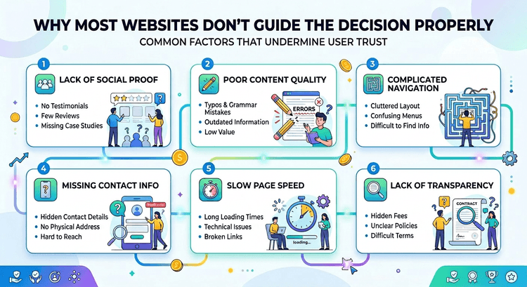
Complexity Creates Friction
Every extra element on a page introduces a small amount of friction.
More navigation links. More options. More text to process.
Individually these things might seem harmless, but together they increase the mental effort required to understand the page.
This is closely related to cognitive load, which we discussed in Cognitive Load: The Hidden Conversion Killer on Most Websites.
The harder it is for someone to understand a website, the less likely they are to continue exploring it.
Simplicity Guides Attention
Simple websites guide visitors toward the most important information.
Strong headlines. Clear calls to action. Logical structure.
This is where visual hierarchy becomes critical. When design clearly directs attention, visitors instinctively understand where to look and what to do.
You can explore this idea further in The Hidden Role of Visual Hierarchy in High-Converting Websites.
Clarity Converts
Ultimately, the goal of a website isn’t to impress visitors with complexity.
It’s to help them make a decision.
When the experience feels simple and intuitive, visitors move forward naturally.
And when decisions become easier, conversions improve.